

Benchmarking is one of the most requested and most poorly executed exercises in corporate finance, mostly because the hard part is not calculating ratios. It is building a peer set that isolates something meaningful.
Why Most Peer Sets Fall Apart
Three mistakes show up repeatedly:
Peers chosen for familiarity, not comparability. Management picks the five companies they already track, usually the largest and most visible names in the sector. Those companies are often at a different revenue scale, a different growth stage or carry a different capital structure, which means their ratios move for reasons that have nothing to do with operational performance.
Metrics chosen because they are available, not because they are diagnostic. Public filings make revenue growth and gross margin easy to pull. They say less about what is actually driving or constraining the business. A distribution company benchmarking gross margin alone, without inventory turns or freight cost as a percentage of revenue, is looking at the outcome without the mechanism.
A single snapshot instead of a cycle. Comparing one year of data ignores where each company sits in its own cycle. A peer that just closed a large acquisition or is mid-way through a capacity expansion will show ratios that look nothing like its steady-state numbers, and treating that as representative skews the whole exercise.
The fix for all three is the same, be deliberate about who is in the peer set and why.
Step One: Define What You Are Actually Trying to Learn
Before selecting a single peer, the exercise needs questions attached to it. These can be:
- Is our cost structure competitive enough to support the pricing we are proposing?
- Are we over-leveraged relative to companies our lenders and investors will actually compare us to?
- Where is working capital tied up relative to peers running a similar model?
- Does our margin profile support the multiple we’re expecting in a sale process?
Each of these points to a different peer set and a different KPI mix. A leverage question needs peers matched on capital structure and lender type. A valuation question needs peers that have actually transacted or trade publicly. A cost structure question needs peers matched tightly on business model, even if they are a different size.
Step Two: Peer Selection Criteria
A defensible peer set is built on a short list of hard filters, applied in order rather than a vague sense of “similar companies.”
| Criterion | Why it matters | Typical filter |
| Revenue band | Cost structures and margin profiles shift meaningfully with scale | Within roughly 0.5x to 2x of target revenue |
| Business model | Distribution, manufacturing, and services businesses carry structurally different margins and capital intensity | Same core model, not just same sector label |
| Growth stage | A company scaling rapidly and one in steady state show different reinvestment patterns | Similar stage: early growth, scaling, mature |
| Geography | Labor cost, regulation and tax regimes distort ratios across borders | Same region, or explicitly adjusted if cross-border |
| Ownership structure | Public companies, PE-backed companies and founder-owned businesses report and reinvest differently | Match where possible or segment and compare separately |
| Capital structure | Leverage differences distort net margin and return ratios independent of operating performance | Adjust to EBITDA level comparisons where leverage varies widely |
Peer set size: fewer than six peers and a single outlier distort every ratio in the set. More than fifteen and the group usually stops being a peer set and becomes a loosely related sector average, which reintroduces the exact problem this exercise is trying to solve. Eight to twelve peers is the range that holds up in practice, tight enough to stay comparable, wide enough that no single company’s anomaly drives the median.
Where the data comes from: public filings and investor presentations for listed peers, private company databases such as Capital IQ or Pitch Book where available, trade association benchmarking reports as a directional cross-check rather than a primary source and direct research through industry contacts and primary interviews when the data is not public. For private mid-market companies, this last category matters more than people expect.
Step Three: Choosing the Right KPI Categories
The categories below cover most benchmarking needs. Not every category applies to every engagement. The discipline is picking the three or four that actually answer the question from Step One, rather than running every ratio available and hoping something interesting turns up.
Profitability
- Gross margin
- EBITDA margin
- Net margin
- Contribution margin (for businesses with meaningful product mix variation)
Growth
- Revenue CAGR (3 to 5 year)
- Year-over-year growth, most recent 4 quarters
- Organic vs. acquired growth split, where visible
Efficiency
- Asset turnover (revenue / total assets)
- Inventory days outstanding
- Days sales outstanding (receivables)
- Days payable outstanding
- Revenue per employee
Liquidity and Working Capital
- Current ratio
- Quick ratio
- Cash conversion cycle (inventory days + receivable days − payable days)
Leverage and Solvency
- Net debt / EBITDA
- Interest coverage ratio (EBITDA / interest expense)
- Debt / equity
Valuation (for M&A, fundraising, or exit planning contexts)
- EV / EBITDA
- EV / Revenue
- Price / earnings, where applicable
Sector-Specific KPIs
Generic ratios rarely capture what actually differentiates performance within a sector. A few examples worth building in:
- Retail: sales per square foot, same-store sales growth, inventory turns
- SaaS / subscription businesses: net revenue retention, CAC payback period, rule of 40 (growth rate + profit margin)
- Industrial / manufacturing: capacity utilization, OEE (overall equipment effectiveness), scrap rate
- Distribution: gross margin return on inventory investment (GMROI), fill rate
- Professional services: utilization rate, realization rate, revenue per billable employee
Step Four: How to Read the Numbers Without Being Misled by Them
Two statistical habits separate a benchmarking exercise that holds up under scrutiny:
Use the median, not the average. A single high-performing or distressed outlier pulls an average in a way that no longer represents the group. The median is far more stable with a peer set of eight to twelve companies, and it is what most sophisticated readers PE investor or a board member who has seen this before will expect to see.
Report the range, not just the midpoint. A single benchmark number invites false precision. Reporting the interquartile range, meaning the 25th to 75th percentile band, shows whether the target company is comfortably inside normal variation, near the edge or genuinely an outlier. This is the difference between “we are below the peer median on EBITDA margin” and “we are below the peer median on EBITDA margin, but still within the normal range for the group,” which are very different messages for a board.
Normalize before comparing. Lease accounting treatment, one-time items, differing fiscal year ends, goodwill, non-controlling interest and owner compensation in privately held peers all distort raw reported numbers. A defensible benchmarking exercise adjusts EBITDA for these items before comparing across companies and states plainly what adjustments were made.
Here is what a properly structured output table looks like in practice, using illustrative figures for a mid-market industrial distribution company being benchmarked against eleven peers selected on the criteria above:
| Metric | Company | Peer Median | Peer 25th Pctile | Peer 75th Pctile |
| Revenue growth (3-yr CAGR) | 8.4% | 6.1% | 3.8% | 9.2% |
| Gross margin | 31.2% | 28.5% | 25.0% | 32.0% |
| EBITDA margin | 11.5% | 13.0% | 10.5% | 15.5% |
| Inventory days | 62 | 48 | 40 | 55 |
| Net debt / EBITDA | 3.1x | 2.4x | 1.6x | 3.0x |
Read as a narrative rather than a spreadsheet, this table tells a specific story: the company is growing faster than the peer median and holding gross margin near the top of the range, which is a genuinely strong position. But EBITDA margin sits below median despite the healthy gross margin, and inventory days run well above even the 75th percentile of peers. That combination points fairly directly at working capital discipline and overhead absorption as the place to focus, not pricing or sales execution. Leverage is also above the peer median, which matters directly if this company is heading into a refinancing or fundraising conversation.
That is what a peer set built correctly should produce: not a single verdict of “good” or “bad,” but a specific, defensible diagnosis of where to focus attention next.
Turning the Table Into Something a Board Actually Reads
A board or investment committee usually needs the visual first and the table as backup. Three formats do most of the work.
1. The quartile range chart
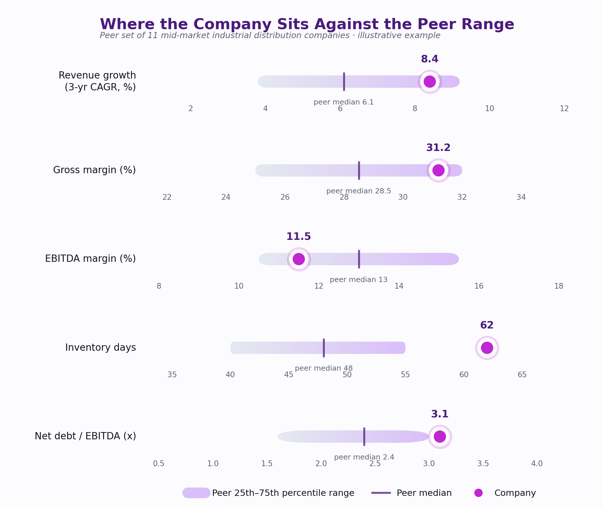
Company position against the peer 25th–75th percentile range, across five key metrics.
What it tells you: each row shows the peer 25th-to-75th percentile band as a shaded bar, the peer median as a tick mark, and the company as a dot. The read is instant. On revenue growth and gross margin, the company sits comfortably above the peer median and near the top of the range, which is a genuine strength worth naming explicitly rather than burying in a table. On EBITDA margin, the company sits below the peer median despite that strong gross margin, which is the first sign that something between gross profit and EBITDA is eating value that peers aren’t losing. Inventory days is the chart’s loudest signal: the company sits well outside the peer range entirely, not just below median. It is a structural flag and exactly the kind of thing a shaded range makes obvious in a way a column of numbers does not.
2. The growth-versus-profitability scatter
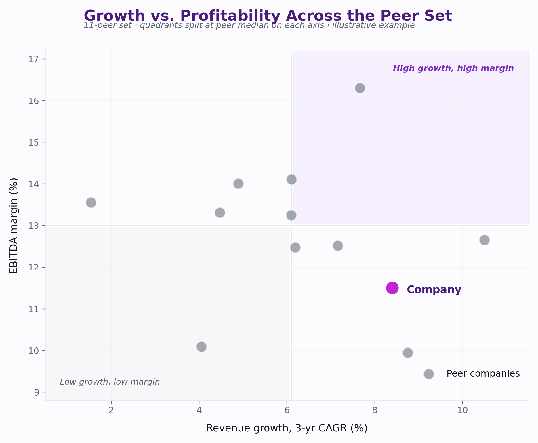
Revenue growth versus EBITDA margin across the peer set, company highlighted.
What it tells you: this is usually the single chart that generates the most discussion in the room, because it forces the real trade-off into view. The reference lines mark the peer median on each axis, splitting the chart into quadrants. Most peers cluster in the upper-left-to-center area, meaning moderate growth paired with EBITDA margin at or above 13 percent. The company sits in the lower-right quadrant: growth ahead of nearly every peer, margin behind almost all of them. Read on its own, the growth number looks like an achievement. Read against this chart, it raises the sharper question a board actually needs to ask, which is whether that growth is being bought with pricing or cost decisions that are quietly suppressing margin and whether that trade is sustainable or self-correcting as the company scales.
3. The multi-year trend against peer median
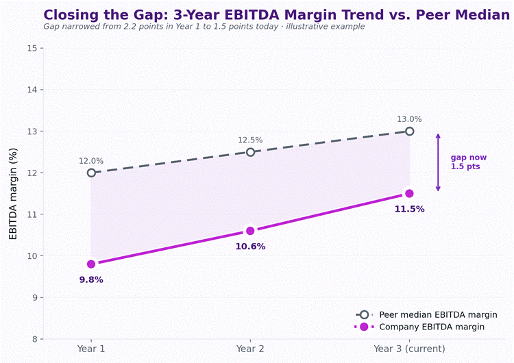
Company EBITDA margin trend over three years against the peer median trend.
What it tells you: a single-period snapshot can’t distinguish between a company that’s permanently behind peers and one that’s catching up. This chart resolves that. The gap between the company’s EBITDA margin and the peer median has narrowed every year, from 2.2 points in Year 1 to 1.5 points in the current year. That’s a materially different story than “below peer median,” which is all the static table communicates. This is the chart that turns a benchmarking exercise from a verdict into a trajectory, and it’s usually the one that changes the tone of the board conversation from concern to a discussion about the pace of continued improvement.
Conclusion
None of this requires exotic technique. What it requires is refusing to shortcut the peer selection step, being honest about what adjustments were made to the numbers and resisting the temptation to report a single average that flatters the story someone wants to tell. A benchmarking exercise built this way survives the first hard question in the boardroom. Most don’t, because most were never built to.
Figures used in the tables and charts above are illustrative, built to demonstrate methodology, not drawn from a specific client engagement.
Syed Mohd Kashif | ValArc Consulting